Wipple’s new error design
October 30, 2023
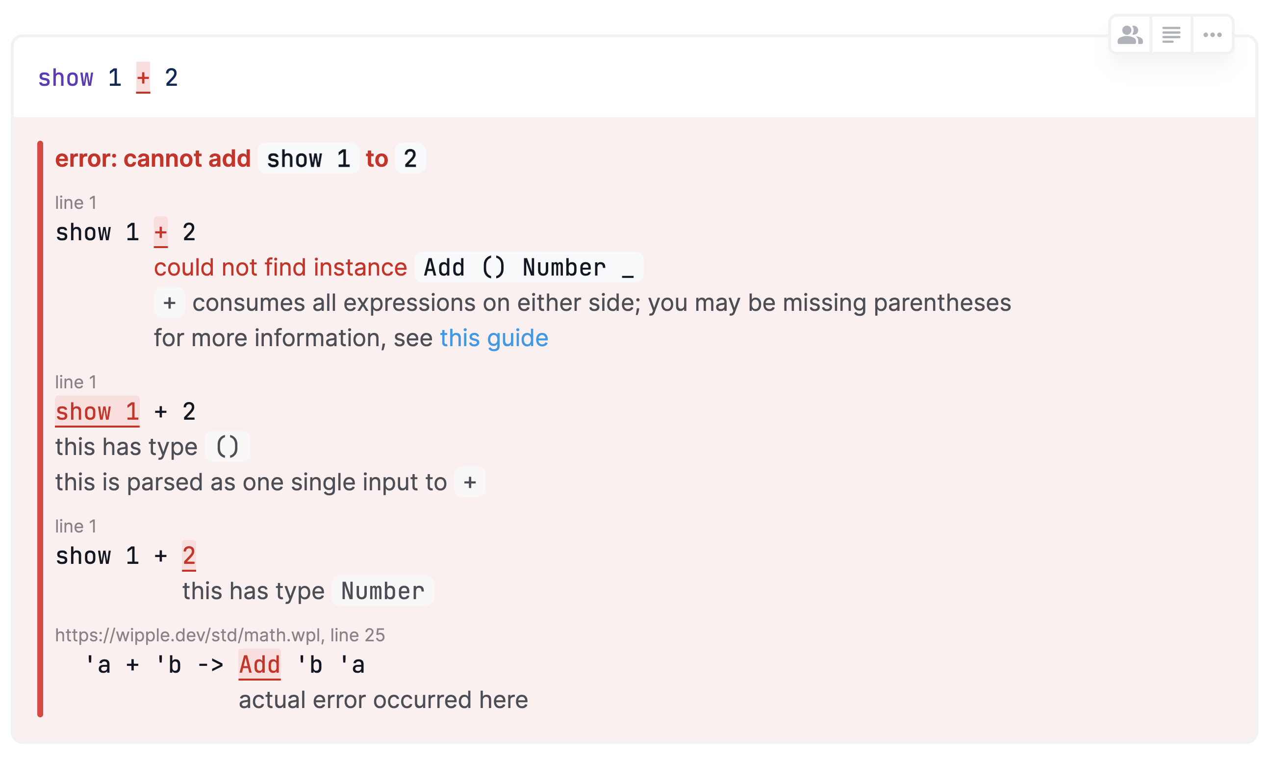
Learning to read error messages is an important part of learning to code, and I want Wipple’s error messages to be useful to beginners and provide help to fix the code. When I first implemented error reporting in the Wipple Playground, it looked like this:

There’s a lot going on here, and it can get overwhelming very quickly! So to make it easier for beginners, I hid all the errors when beginner mode was enabled:

Now the user had to hover over each place in the code where an error occurred, but it was still pretty overwhelming (not to mention annoying if you’re just trying to place your cursor).

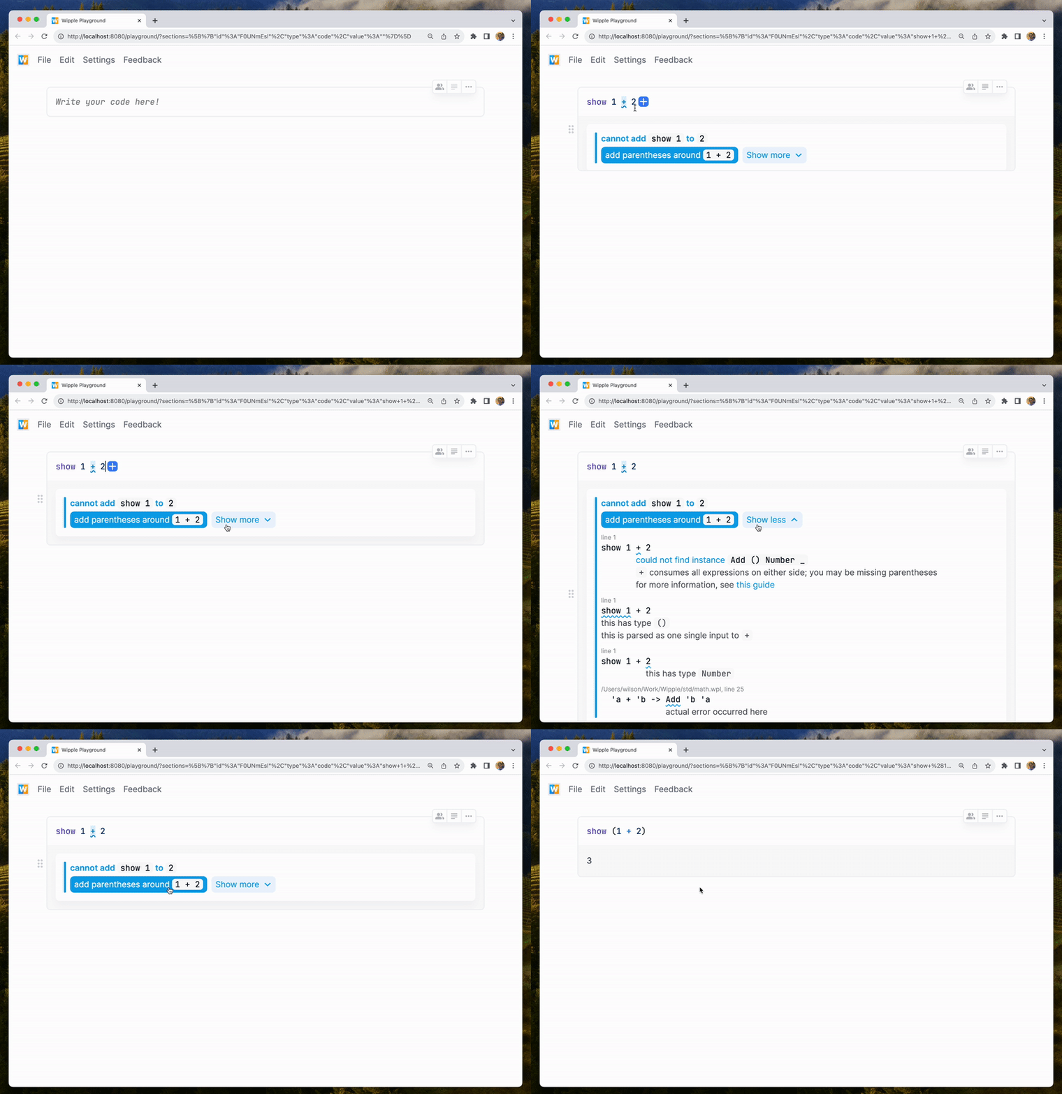
In response to these issues, I have redesigned the way errors are displayed in the Wipple Playground! First, I switched out the red for a calmer blue color. By default, only the primary error message is displayed; you can click "Show more" to reveal all the details and the location in the source code. This button is per error message, so you can read about a single issue in more depth without expanding all the other diagnostics. And finally, the fix-it button appears right below the description so it can be easily applied.

Here’s a GIF of the new design in action!

